
One arrow, moving
Strip away everything a race car appears to be doing, the braking, the turning, the shifting, the sound, and what is left is a single arrow: the car's acceleration, swinging and stretching from moment to moment (Milliken, RCVD, p.8). Braking is the arrow pointing backwards. Cornering is the arrow pointing sideways. Trail-braking into an apex is the arrow leaning back-and-sideways at once. The whole art of driving fast collapses into one sentence: keep that arrow as long as possible, in whatever direction the track needs next.
Chapter one ended on the reason this arrow has a limit at all. The four handprints of rubber have one grip budget, spendable in any direction but never twice (Smith, Tune to Win, p.23). So the arrow can only reach so far. The question this chapter asks is beautifully simple: what does the reach of that arrow look like, in every direction at once?
Plot every moment of a lap
Here is the trick, and it is one of the great tricks of the sport (Milliken p.8). Take a lap of telemetry. Twenty times a second, write down two numbers: the sideways acceleration and the forward-or-backward acceleration, both in g. Now plot every one of those instants as a dot, sideways g across the page, braking and driving g up and down it. A lap becomes a cloud of two thousand dots, and the cloud has a shape.
This is called the g-g diagram, and once you have seen one you cannot unsee it. Here are two of them, side by side. On the left, my best lap in this setup on the hot track: a 1:50.796 from a late practice run at Silverstone, about 16 liters of fuel aboard, 37 °C track. On the right, the fastest race lap I have data for in the same car, at the same track, on the same setup: a 1:49.405. Both clouds are drawn against one shared envelope, pooled from 137 laps of this car at this circuit, so the two laps are judged by the same yardstick.
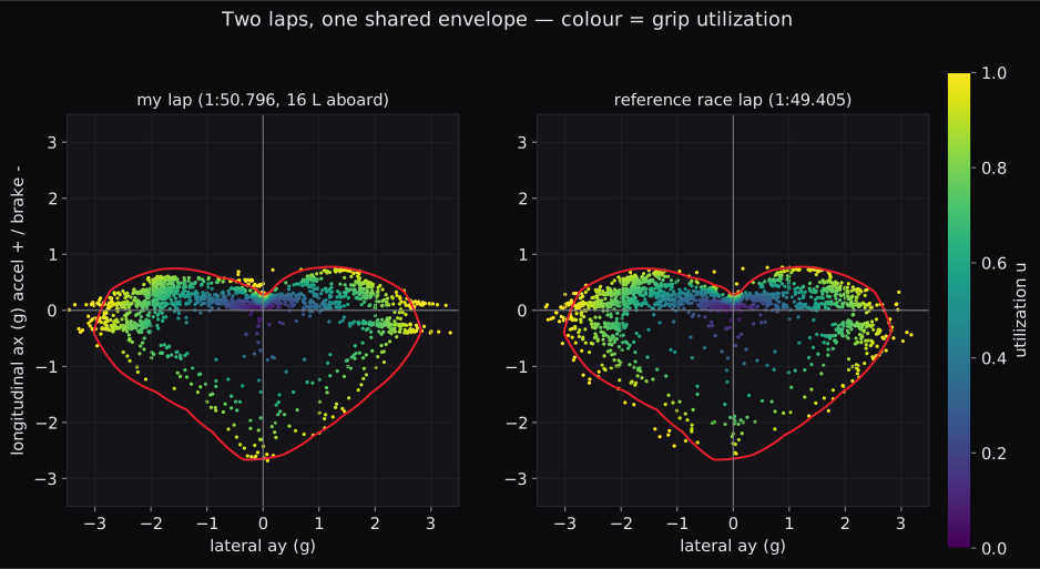
Read them like maps. The far left and right edges are pure cornering. My lap reaches about 2.7 g of lateral acceleration once spikes are discounted, with brief excursions past 3. The bottom edge is braking, around 2.1 g. The top edge is acceleration under power, and it is tiny by comparison, barely half a g, because above low speed this car cannot spin its tires; the engine runs out before the grip does. And the interior of the shape is everything the car could have done at that instant but was not asked to.
Every point on the rim is the car flat against its limit. Every point in the middle is capability going unspent, which is sometimes a straight (nothing to spend it on), and sometimes lap time (Smith p.24). Hold the two panels together for a moment before we go on: same car, same envelope, 1.4 seconds apart. Where those seconds live is a question this chapter comes back to with a better instrument than the eye.
Three drivers at Paul Ricard
This picture is old, and its first famous use answered a question people still argue about in paddocks: what actually separates the quick driver from the merely good one?
In 1977, three world-class drivers lapped the same grand prix car at Paul Ricard with an early data system aboard, and their laps were plotted exactly this way (Milliken pp. 8 to 11). The finding was not that the fast drivers had some exotic style. It was that they spent most of the lap out on the boundary: the acceleration vector held long, swung smoothly from braking rim to cornering rim to power, corner after corner, with as little time as possible spent in the soft middle of the diagram.
From this Milliken draws the two requirements that define the entire engineering problem, and it is worth quoting their logic because the rest of this study hangs off it (p.11; restated p.373): a race car must offer the largest possible g-g envelope across its whole speed range, and it must have control and stability qualities that let a skilled driver actually live at that boundary. The first is the size of the shape. The second is whether a human can ride its rim without falling off. Setup work, all of it, every spring and wing and pressure we will ever touch in this series, is an argument with one or the other of those two requirements.
The circle is really a stack of circles
Chapter one made a promise that downforce is close to free lap time, because it presses on all four prints at once (Smith p.16). The g-g diagram is where that promise becomes visible, because the envelope is not one circle. It is a different circle at every speed, and the instrument can pull them apart. From the same lap, split into speed bands:
| speed band | cornering limit | braking limit | drive limit |
|---|---|---|---|
| under 126 km/h | 2.33 g | 1.01 g | 0.72 g |
| 126 to 180 km/h | 2.60 g | 1.78 g | 0.56 g |
| over 180 km/h | 2.72 g | 2.37 g | 0.30 g |
Look at the braking column. The same car, the same brakes, the same four handprints, and the braking limit is 2.4 times larger at speed than in the slow stuff. Nothing about the friction changed. The load changed: at 250 km/h the wings are pressing the car into the road with far more than its own weight, and chapter one's load-sensitivity math pays out exactly as advertised, more load buying more absolute grip (Smith p.16). Meanwhile the drive column runs the other way, shrinking as speed rises, because up there the limit is the engine, not the tire.
So the honest picture of this car's capability is a stack of nested envelopes, small at parking-lot speed, swelling enormously as the aerodynamics load up (Milliken develops the full structure of these boundaries in Ch.9, pp. 346 to 355). This is why the fast corners and the slow corners are almost different sports, and why a braking point at the end of a straight is so deep it feels like a typo: the car brakes hardest precisely when it is going fastest.
Riding the rim, measured
Smith's instruction from chapter one, ride the rim of the traction circle and never the empty middle (p.24), stops being a metaphor the moment you normalize the cloud. Divide each instant's acceleration by the envelope's reach in that direction and you get a number $u$ between 0 and 1: how much of the available limit that instant used. Plot those and the rim becomes a unit circle:
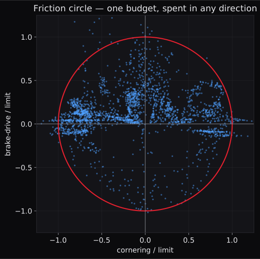
Now the lap can be audited phase by phase, and the numbers say where on the rim this lap actually lived. Median utilization while braking: 0.74. On corner entry, brakes and cornering overlapping, 0.76. Mid-corner 0.78, corner exit 0.71. And 71% of all braking samples on this lap happened while the car was also cornering: the trail-braking blend Smith prescribes (p.24) is measurably there, most of the braking bent around the entry arc rather than spent in a straight line.
Across the whole lap the median instant used 0.662 of the envelope, and 12% of the lap sat within 10% of the rim. Are those numbers good? That is precisely the kind of question the instrument refuses to answer. A straight should sit deep in the middle of the diagram; the middle is not all waste. What the instrument will do is hold the number steady so it can be compared: across the seven clean laps of that session, the median only wandered between 0.652 and 0.677, and across the twelve clean laps of a race-length stint the same night, 0.644 to 0.675. It is a stable property of how this car was being driven, not a one-lap accident. Numbers like that are the raw material; what they mean is the driver's problem, and I intend to keep it.
Two laps, one map
Here is where the diagram earns its keep. Silverstone, same track temperature to the decimal, same setup (the same setup file, only the fuel fill differs, because since last week I run the race setup of the fastest driver I have data for), and two laps: my best from that late practice run, and his best from an actual race. His lap is 1.392 seconds quicker. The g-g cloud says the capability was there in my car. So where does a second and a half live?
Subtract one lap's elapsed time from the other's, continuously along the lap distance, and plot it:
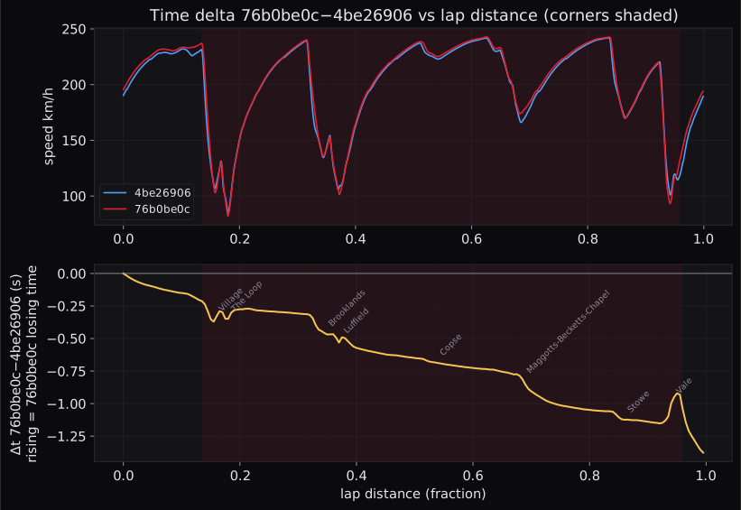
This trace is the whole comparison in one line, and its shape is more interesting than its total. The time does not leak evenly. It goes in packets: −0.29 s through the Maggotts-Becketts complex, −0.22 s through Luffield, −0.16 s at Brooklands, smaller slices at Copse, Stowe, and Village. And one window appears to run the other way: through Vale, +0.15 s comes to me.
The packets carry a lesson that took me a while to believe. Through Village and The Loop, the reference lap's slowest speed is lower than mine, four km/h slower at Village's apex, and the window still goes to him or ends nearly even. His single biggest gain, the Maggotts-Becketts complex, is exactly where he carries more apex speed, nearly 8 km/h of it. Minimum corner speed, the number every sim racer stares at, is neither the whole story nor even a reliable chapter of it. Time is the integral of the whole path through the corner window, of how early the arrow swings from braking to cornering to power. Which is to say: time lives on the rim of the g-g diagram, not at the speed trap at the apex. Two different points on the same circle can pass the apex at different speeds and arrive at the exit together.
Then there is Vale, and Vale is the best lesson on the whole map, because at first glance it flatters me. Through the window itself I carry almost 8 km/h more apex speed than the reference lap and take back +0.15 s. Now follow the line just four more percent down the road. Between Vale's exit and the finish line I hand back 0.38 s, two and a half times what the window gave me. The speed trace says how: I am still nearly 4 km/h up in the middle of Vale, and within a hundred meters of its exit he is 12 km/h up and holds 8 all the way to the line. When I saw this map, my sector-five problem stopped being a mystery: I come out of Vale going way too fast, and the final corner onto the pit straight pays for it. So the corner window is not the unit of lap time any more than the apex is. A "gain" inside one window can be a loan taken out against the next, and the trace is the only honest ledger of it.
One honest caveat, stated rather than smoothed over: his race lap had eight and a half fewer liters of fuel aboard than mine. Same air density, same track temperature, zero slipstream for either (the instrument checked), but that fuel difference is real mass and it is in his favor. The comparison is a map of where to look, not a verdict.
The circle moves under you
There is one more dimension, and it is the reason the same night also contained a race-length stint. A race is not a lap; it is thirty of them, and the envelope does not hold still that long.
I ran the stint to feel exactly that, and the seat feel by the end was blunt: the left fronts felt almost completely gone. Here is what the instrument saw over those thirteen laps:
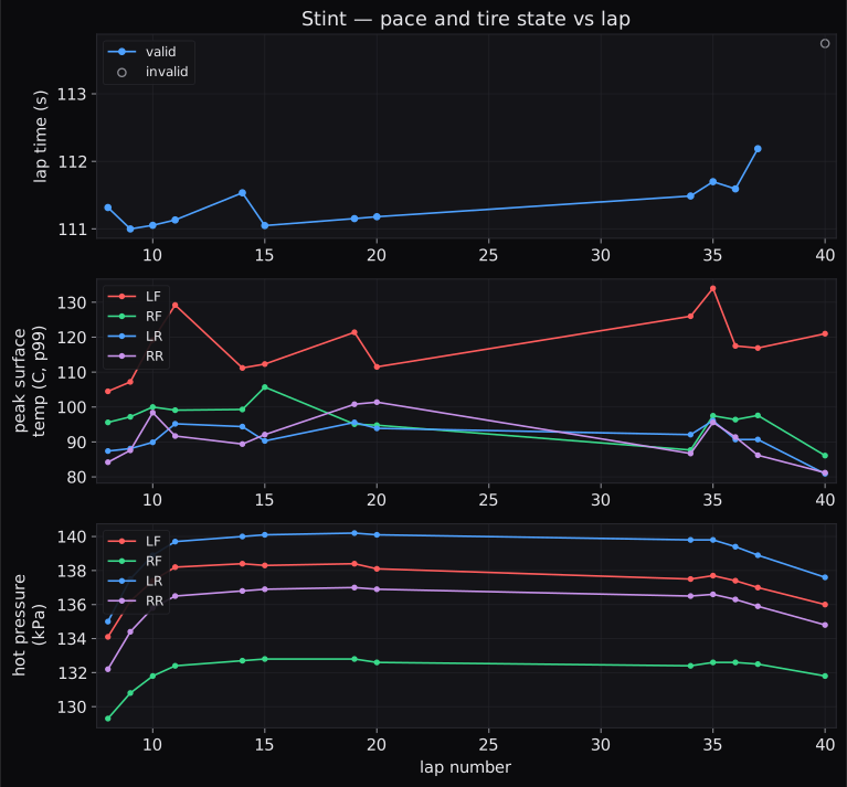
The left front is the hottest tire on the car on every single lap. Silverstone Arena GP turns right far more than it turns left, so the left front is the shoulder every fast corner leans on. Early in the stint its surface peaks around 105 °C. By the final laps it is peaking at 117 to 134 °C, while the pace drifts from low 1:51s to high 1:51s and then a 1:52, about +0.2 s per lap across the last run. Chapter one gave the tread its working window, roughly 88 to 104 °C for a typical dry compound, measured settled on a pyrometer (Smith p.18). An in-lap surface reading spikes hotter than a settled pyrometer number, and the two should not be casually equated. But the trend needs no calibration: the left front climbed all stint and finished far above where it started.
And here the instrument also confesses what it cannot see, which I have come to think is its most important habit. This car does not stream tread wear mid-run (the wear channel sits frozen at 100% all session), so the one number that would directly measure "the tires are gone" simply does not exist in the data. The seat said gone; the temperatures and the fading pace point the same direction; the wear figure is silent. An instrument that tells you which of its dials are dead is worth ten that pretend.
There is one more question the temperature channel can answer: where on the lap does the left front take its beating? Split the heating by corner and two places do most of the cooking, and they point straight back at the time map. Through the Vale chicane and the final corner, my left front picks up 29 °C per lap against the reference lap's 20. That is the same overspeed the time ledger flagged, now written on a thermometer: I take too much speed into Vale and the left front pays for it through the last corner. And the single biggest heating event on my lap is Luffield, the long right-hander: 40 °C per lap against his 24, and on every one of the thirteen laps, the tire's hottest moment of the whole lap lands there. My working hypothesis, stated so a later test can judge it: the sector times and this thermometer are two gauges reading the same habit. The instrument cannot confirm a habit. It can only say that the time and the heat leak from the same places, and it says that plainly.
So the g-g envelope is not a fixed property of the car. It breathes with speed, and it decays with heat and laps. The biggest shape on paper means nothing if it has shrunk by lap twelve, which is why the second of Milliken's two requirements, a car a driver can keep at the boundary lap after lap, is a tire-temperature problem as much as a handling one.
Where this leaves us
The g-g diagram is the sport drawn as one picture. Every instant of driving is a point; the boundary of the points is everything the car can do; the fast laps are the ones that live at the boundary and swing along it smoothly instead of visiting the middle. The boundary grows with speed because downforce loads the prints, exactly as chapter one's load-sensitivity arithmetic promised. And it moves, lap by lap and degree by degree, under the driver holding it.
What decides how big the envelope is, and which tire runs out of it first? Load. Which tire carries how much of the car, standing still and in every transient: braking, cornering, both at once. That machinery has a name: weight transfer, and it is Smith's chapter three. It is also, not coincidentally, the first thing a setup sheet actually adjusts.
Sources: Milliken and Milliken, Race Car Vehicle Dynamics, ch. 1 (pp. 3 to 11), ch. 9 (pp. 346 to 355), p. 373. Carroll Smith, Tune to Win, ch. 2 (pp. 23 to 24), p. 16, p. 18. Telemetry: my sessions 4be26906fc4b6e99 (the featured lap) and f2667b334982a50f (the race-length stint), both Silverstone Arena GP, 2026-07-08, and the reference race session, all analyzed with the vdyn engine; figures generated directly from the data.